Pages

Saturday, March 31, 2012

Slow Week

Well, it was a slow week....not because it was calm...nope...it was crazy busy with baseball practice and birthday parties, plays and haircuts.  It was slow because I am hurting from working out too hard...I have a bit of an injury.  That meant early to bed and ice/heat.  That sures does cramp the crafty side of things.

I have a layout to share that I did a little bit ago.  It celebrates the concept of being bold.  Me...I am not so bold, until you meet me and I am comfy.  I am bold with my beliefs, how I will stand up for myself and others.  Bold when defending anyone I love.

My daughter...bold times five.  I made this layout to celebrate that trait.  I used the new Teresa Collins Fabrications line for this.  The purple in this collection is awesome!!


Because the colors in this collection are so rich and vibrant, I used a neutral background.  I then created some bold pops and a trail of confetti! 


Teresa has a mid-season release coming and I can't wait until it is revealed!  Be on the lookout on Monday...head to her blog to see it!

Off to catch up on the week.  Or maybe take a nap...


Wednesday, March 28, 2012

Behind the Page: Secret Be Told

Oh, how I would love to be a fly on the wall to see some of my favorite designers when they put together a page.  Do they get done and then see something not quite right?  Do they find a way to fix it and make it feel right?  Or is every page easy?

I was given a challenge this month from Webster's.  I was asked to reinvent an old school trend.  And I went blank.  I asked around and even went through some very old issues of Memory Maker's magazine.  Gosh, have scrappy times changed.

One thing that stood out to me was metal bookplates.  Back in the day, these would be positioned under a photo...just one, holding a title or a piece of vellum with a saying.  Raise your hand if you did that...

I decided to multiply them...like bunnies.  I imagined a vertical column of banner flags and substituted the metal bookplates.  That part came easily in my thoughts.  I laid it out and it felt right. 

How to balance the other side...that caused my struggle.  I had to add in the yellow and white in the left corner and the blue photo corners to close it all up.  Sorta reminds me of the sun.  Here is the page:


A funny thing happened along the way with this page.  I didn't really have a title.  Then I started using a bunch of patterns under those bookplates.  Well, patterns go with bathing suits too.  Word Association 101.  Hence, my title was born.  or should I say stumbled upon.


See the gorgeous blue Silhouette.  It was in the middle of the two photos.  I had the trim tucked underneath too.  But it was too heavy.  Too disjointed.  It tricked my eye.  So I moved it and then added in the green circle.  In person, the photo is ripped a bit so I had to put the trim over the edge of the photo.


The journaling, oh the journaling.  It was not as long across on my first go round.  It looked so funny to me and I had to fix it.  How when it is already on the page.  I studied the text I wrote and decided to add in some words to make the journaling stretch horizontally.  See the word "great" up there, it was added.  The words, "most definitely" were added.  The "happy you, and "try to shop and" came late.  Yep, sometimes it takes a few go rounds.


I used the gorgeous Palm Beach line here...it is so pretty and has lots of chevron with it!  And pink trim and that blue!  Yum!

Secret be told...this page didn't come together easily, but it came together just as it should be.  Words to remember.

Monday, March 26, 2012

Monday's Musings: What You Love

Before I get to musing, I wanted to remind  you to leave a comment here to be eligible for a prize in the Nook Spring Bloghop!  Now onto today...

What topics do you scrap about?  Do you include enough All About Me layouts in that mix?  I found myself doing just that this weekend.

Maybe because I feel busy right now...like time is not mine and free time is limited.  Maybe scrapping about what I love brings me some "me" time. 

The other thought that pops into my mind is that I want to mix up the scrappy process as much as possible.  Push myself and the creativity.  I decided to simply walk around my house with my phone and snap away.  What struck me as important?  What do I reach for each day and don't even think about doing it?  What defines me?  I snapped and sent my photos to be printed.

And now, I feel refreshed.  Maybe it is taking time to record a story specific to me.  I think that mostly it is the change in topic, the use of photos I don't always scrap.  It felt good to make this.

Simple, not even that important in the grand scheme...but one day when I am gone and my kids read this, they will have a piece of me. 


I used the ruffle trim in the April My Scrapbook Nook kit on this tag.  The trim is bulky and full...I wanted the texture of it without having all that material.  So I cut off the extra tulle so it was mostly the thread...I like how it looks.


Of course, the story.  That is what this hobby is to me!


I used this gorgeous kit to make this layout!


Full of Crate Paper Storyteller...I am inspired!  You can be too:  New members who sign up will receive the May kit for FREE and A beautiful October Afternoon Grab Bag Kit. After a year paid subscription your 13th kit will be for FREE! 90.00 Value for free!
whatcha waiting for?

Sunday, March 25, 2012

Be My Guest: Little Yellow Bicycle

If you have stopped by for the Nook blog hop...welcome!  The original post is one down from here!  You can leave a comment to be eligible for prizes here.  I have a fresh post to share with you today as well...non-Nook related!

What products were you scrapping with when you started delving into this hobby?  It was over ten years ago for me and I loved to play with Bo Bunny, Basic Grey and Little Yellow Bicycle.  My favorite thing to do on the weekend was go to my local scrapbook store, Wiggles and Giggles, to shop.  Darlene, the owner, always carried those companies.  Some of my favorite layouts of all times come from Little Yellow Bicycle products.  They have been perennial favorites throughout the years.

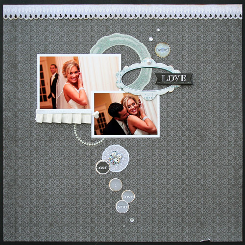
So imagine how pleased I was when I was contacted to be a guest designer.  LOVE it!  I immediately said yes! and was sent a generous box of one of their newest collections.  It is called Swoon and it is full of whites and grays.  It is a wedding collection...and I used it specifically for that topic! (this week anyway...)

I made two layouts featuring the Clear Cut Shapes, which are transparent beauties...  Here they are:

This one is simple...but I adore these photos of my friends, Trish and Chris. Their love for each other is so obvious and I just wanted that to shine.


And this one of Trish and her bridal party...they are all gorgeous!


To see my inspiration for creating these layouts and learn more about me, head to the Little Yellow Bicycle blog.  It is full of amazing designs. 

I am so honored to be a part of the excitement this month!  Thanks Liz for the chance to design with a favorite!


Friday, March 23, 2012

Spring Hopping


Welcome to the My Scrapbook Nook Spring Blog Hop! Thanks for stopping by! Hiding among the blogs from the list below are 5 prizes and one HUGE Grand Prize! We're giving away FIVE $10 prize packs and ONE prize pack valued at $150! So be sure to leave a comment on EACH blog's post, because you never know which blogs have these prizes hidden. To qualify for a prize, comments are due by Midnight PST on Wednesday, March 28th, and all winners will be announced on the My Scrapbook Nook blog on Friday, March 30th.

Here are the blogs from start to finish!
Katarina
Carol
Pam
Lilith
Shellye
Nicole
Hilde 
Marinette
Deanna
Gina
Danni
Jessy
LG
Anna
Stacey: You are here!
Leah

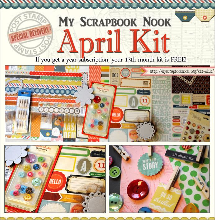
Here is a layout I did a couple of weeks ago using the Feb. kit~I just received my April kit full of Crate Paper's Storyteller and can't wait to use it!  Look at how awesome it is!


In the meantime, here is why I love the Nook kits:


Here are a couple of reminders you don't want to miss:

Don't forget that the Nook April special is that new 12-month subscribers get the April kit for FREE and then after their subscription is over they receive ANOTHER kit for FREE!
This month's April Grab Bag is valued at over $55, but only $10 for kit subscribers.

Guess what ELSE is happening at the Nook right now? We're having a DT CALL!!! Be sure to check out our message board to find out more info!

Thanks for hopping with us!     

Tuesday, March 20, 2012

Behind the Page: Big, but not Heavy

I am always drawn to scrapbook pages that have that little something different.  Those pages with a bold design element or clever use of a product really stand out to me. I totally adore pages with long, different sized titles...but sometimes I struggle with replicating.  I worry when is big too big and when is heavy too heavy?

I might have found a way to address that concern on a recent Webster's Pages layout.  I like the design of this one.  I tried to use perpendicular and parallel lines to mimic the streets of a map, since the topic has to do with cars.  That element came easily.  The banner was a way to add a curve to all the straight lines.  Easy again since I just hand cut it from a sheet of one of the Game On papers. 

Then what?  How do I make this stand out more?  I thought I wanted my journaling in the space between the crossing lines and those word tickets.  Then I thought of the title...a count down of sorts.

3, 2, 1...go.  I tried out some smaller numerals, but they didn't feel right.  At the same time, the large chipboard ones were too heavy.  So I traced...used a large 3 and 1, and a smaller 2.  Here is the layout:


I love how the traced numerals take up that space, make that impact, but don't overwhelm.  I was able to add a colorful title to balance out all green.  The journaling is meant to connect everything and help the eye move.


I used the Game On collection from Webster's Pages.  There is trim and that cool Perfect Accents. This collection is pure fun and can be used for some many topics/themes!

It is big, but definitely not too heavy!

Speaking of fab scrappy goodies, my April Scrapbook Nook kit is on the way...it features Crate Storyteller!  And, each month, the Nook is featuring a grab bag of awesome goodies that coordinate with the kit...April's will be wonderful! 

Hope you have fun designing your page today!

Sunday, March 18, 2012

At Home: The People

Sundays At Home usually mean decorating or DIY projects.  But, today I want to focus on the people at home.  A house is a home because of those we let in and those we love.  Yes, I have been sprucing up for spring and changing things up around my most lived in rooms.  But, today I would like to share a story about an influential person in Steve's life.

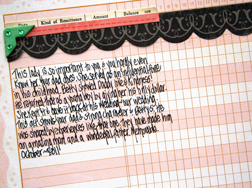
This person surely made his childhood memorable.  She showed him that you can have a second home due to the kindness of neighbors.  The expression "it takes a village" was meant for Betty.  I had the chance to snap some pictures of Ella with Betty this past fall.  I realized that she doesn't know Betty's story.  It needed to be told.


Here is the journaling:


I used Crate Paper on this one!  It was actually for the March Color Challenge, but I messed up the date it was due.  I am all about messing up my days this month. 

That's okay, because I am focusing on the bright moments and all those that I love!

Friday, March 16, 2012

WOW! Am I In Love!

on sooo many levels!  In love with the In Love collection by Webster's Pages.  In love with the new movie that Brandin created to celebrate shipping week. 

And mostly in love with the idea that some lucky, lucky Webster's fan can win a $500.00 shopping spree!  That is not a typo...can  you imagine a spree that big!  It can buy you one of every single thing plus more!

To find out how to win...race to the Webster's blog...check out the movie and follow the directions!

To leave you with some motivation, here is a recent Webster's project!  I created a quote book about weddings and marriage!  I kept the design simple since this one is all about the words and the advice.  Plus, it allows for small photos to be placed inside at a later date!


I created the white flower using one of the gorgeous tulle trims from In Love!  I wanted to use lots of trim to give the book elegance and texture.


I used In Love papers and trim as well as Dazzle Me Gems!  I put in dots of Sparklers here and there!  Love this collection and I know you will too!


Thursday, March 15, 2012

Thursday Trending: Light On Paper

Nope, not just being cheap.  Yep, I have plenty of 12 X 12 sheets of paper.  Nope, not too lazy to use my paper cutter.  Hmmm...maybe I am looking for quiet patterns.  I am not sure what it is...but I am craving minimal paper.  One background and then pops somewhere else.  Maybe along the side or the top.  My eye needs rest.  Maybe it's because the rest of the life is crazy!

Here is an example.  Note the calm background...there is tonal contrast.  Then,,,the pops.  Especially in the form of a grid.  Yep, I know it is not technically a grid, but that was the inspiration.


I wanted all the color and pattern to come from these cute chipboard pieces by Bella Blvd.  I adore chipboard...it is my favorite embellishment!   Most of this paper is from older collections, but Bella is timeless and it all goes well with each other!

I created that small ribbon-like award using a piece of chipboard and two sticker banners.


The little bits of pattern pop:  red hearts, stripes, yellow chevron. I went with an orange alphabet for this one!  It seemed a bit boring so I added the heart and button center.


Minimalist, maybe.  A phase, a trend in my scrappy world.  A new source of fun...and that is what this is all about!


Tuesday, March 13, 2012

Tuesday's Thoughts: Pajama Love

I wonder if there is anything wrong with living in pjs as often as possible.  Is it bad to put them on as soon as possible after a long work day?  Is it terrible to stay in them all day on a Sunday?

Is this habit less offensive if you shower first and then put pjs on?  or what about matching sets...you know, cute ones with little tees and pants, all with coordinating patterns. 

Should I be called a bad parent if I have passed said pajama love down to my children?  As in...Nathan wears his favorite Transformers pair even though they are 2 sizes too small.  He looks all tall and lanky.  Cracks me up.  Poor Ella gets all the hand me downs and mismatched ones.  She has to resort to t-shirts and whatever pants she can find.  She actually told my mom that I never buy her cute pairs.  She might be right.

I think pajamas represent comfort, home, a longing with quiet and reflection.  It means lazy cups of coffee and hanging out watching Saturday morning TV.

I might have an entire Pinterest board devoted to the latest and greatest fashion.  Cute, pulled- together outfits with matching necklaces and purses.  But at the end of the day....(and the beginning and middle), I just want pajamas. I am a fan...

See:


For more information on this layout, check out the Bella Blvd. blog!  I debuted today as an on-going guest designer!

Before I go and snuggle up in my flannels and fuzzy socks, I want to share two big announcements.  First, the Nook is running a Feb. special:


And, my other home away from home...Webster's Pages is having a shipping party all week!  That's right...the new collections are shipping.  Be sure to check out the blog for fun projects and giveaways!

Hope you find joy today!


Sunday, March 11, 2012

At Home: Budget Decorating

Happy Sunday!  Today is the day I am taking down winter and dressing my house for spring.  I can't wait to freshen things up!  I don't know about you, but I am an impatient decorator.  I am bothered by unfinished spaces or gaps.  I also don't have a million dollars to spend so I need to think fast and think on the budget.

I sometimes call it Level 1 decorating...I plan to make a space look pretty even if I don't have everything I really want.  I did this with my living room last year.  It looked livable and pretty.  Then I moved to Level 2, which consisted of finding those special touches.  Books from my personal library were switched out with vintage ones.  Knick knacks were replaced by antique cameras.  I switched things out with items with more personality, depth and character.

When we first moved in, I worked on Ella's room.  It is a much bigger space than her old room so I needed to go to Level 1.  I headed straight to Jo-ann's to do so.  The home section there is very small, but you can get some neat finds on the cheap.  I also knew that Ella's room had a garden fairy vibe so I hit the outdoor and spring section of Jo-ann's.  Outdoor garden items make for adorable decorations.  Here are some of the details:

Top of her armoire...I used many of the stuffed animals she has received over the years.  That basket used to hold diapers and creams where she was an infant...I am just using it in a different way.  Notice all the crowns!


I like to use sentimental objects when decorating.  This was her communion dress.  We went a bit untraditional when we chose it...I love this though.  Sweet and muted!  It hangs from her bookcase.


And her well-worn ballet slippers.  I couldn't throw these out so they make a cute addition to her displayed items.


This is her desk.  I picked it up at Marshall's.  She loves it!  I can't keep it clean, which makes me nuts.  But it is her room...


Her dresser.  I got this silver vase from Ikea.  I love having some touch of metal throughout the room.


Here is one of the main walls.  My mother in law found these Pottery Barn shelves at a tag sale.  They were silver so I just repainted.  I have a mix of vintage goodies and many items for the garden section at Jo-ann's.  The pig and birdhouses are antiques.  And, of course, I made some things.


The pig makes me smile...


Finally, to add some texture I reused these Oriental Trading pompoms.  They were orginally used for her birthday party.  They add whimsy!


I love the fact that I won't feel guilty about switching some of this stuff out when she gets a bit older.  That gives me time to look for Level 2 items at antique shops and tag sales.  Just think, I can think move all the garden items outside...