Pages

Thursday, February 28, 2013

Lily Bee's Birthday Bash Blog Hop


Four years ago, Kristen launched Lily Bee Design, went to her first CHA and the rest is HISTORY!  Lily Bee made a splash and continues to do so today!

We are celebrating our 4th birthday all week long with daily blog hops and we’re giving YOU the chance to win the gifts! That’s right, each day will be a different hop with more chances to win! 

Today, I am sharing a clean and simple layout designed with a boy's birthday in mind!  I kept the details grounded in primary colors and added interest in masculine ways!

Here is my celebration layout!


I went with a grid like feel, but kept things random!  To create this layout, I mixed Persnickety with Destination with Pinwheel with Christmas Cheer...that is why I love Lily Bee!


I used the Celebrate stamp on the brown Kraft stamp and then layered some banners and stickers!

My title went along the bottom, complimented by the bright red and white polka dot paper!


Supplies:  Persnickety (Papers, Journal Index Cards, Cardstock Stickers), Christmas Cheer (Paper-Numeral 8), Destination (Papers, Chipboard Stickers, Label Stickers, Chit Chat Stickers), Pinwheel (Paper, Label Stickers), American Crafts Alphabet


So how can you win!?  So many ways! Make sure you leave a comment on each designer's blog 
& head back to Lily Bee Design's blog for  your chance to win every day.  You can also:
·       *   Follow the Lily Bee Design blog
·       *   Leave a comment on the Lily Bee Design blog telling us [something TBD]
·       *   Bonus entry opportunities:
o   Like Lily Bee Design on Facebook (with link to the page)
o   Follow Lily Bee Design on Instagram (with link to the page)
o   Follow Lily Bee Design on Twitter (with link to the page)
o   Follow Lily Bee design on Pinterest(with link to the page)
o   Pin any of this week’s design team projects that have inspired you, tagging #lilybeedesign so we can easily find the entries.

That’s a lot of ways to win!  You have until Sunday (3/3/13) at midnight (ET) to leave comments.

Be sure to make the Lily Bee blog a regular, daily stop...we host challenges weekly and would love for you to play along!

Here is the blog hop order for today:

Stacey Michaud--That is me

Happy Day!!


Monday, February 25, 2013

Monday's Musings: It Makes Me Smile

I love those moments in life where a smile takes over...it is not forced...it is just easy.

This photo makes me smile.  It shows two happy families.  Even happier to be together.

I love how Ella and Nathan are holding Riley's hands.

I think you can see the happiness radiating from me.

I can't wait until the spring when we get together again...plus two more families.


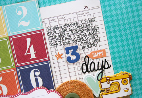
I used a mix of Jillibean Soup to create this bright and cheery layout...I adore that blue background!   The mix of red and orange...yummy!  I went with numbers here.


Three days, 8 family members (Logan was still in Cynthia's belly!)...

one priceless photo!

Smiling here...


Sunday, February 24, 2013

At Home: Master Bathroom Renovation

I have waited for two years...lived in a dark, cramped space, dreamed every day of what a new space would look like.

We have arrived!  The master bathroom renovation is happening.  Like many renovations, we opened the walls and floors and found a ton of problems.  So the past two weeks have been all gutting, fixing, building pipes and installing electricity.

Our house belonged to my mother and father in law for many years and they ran a home day care center out of the great room.  There was the original, galley style full bath and then a changing room behind it.  We decided to make it into one, large master bathroom.

Before:

The view from the bathroom looking into the bedroom...old shower stall.


During:

We removed the shower and linen closet completely to open up the space.  The door will be made larger and the wrap around vanity will start on this wall and continue around the L into the next space.


Before:

Old shower is on the left and then there was a doorway going into the changing room.


During:
Standing in the same place.  The large shower will go where the sink and toilet were.  It is already being framed out below.  We love how the space opened up.


This was during the gut when the wall where the shower sat was still up. 


New shower will be here where the toilet was. That doorway to the hallway will be gone so the only way in will be through our bedroom.


It is very fun to see it all gutted and ready to go!  This is what I am hoping for when it is done.  I picked gray vanity cabinets like this image:


I wanted to do Carrara marble, but it stains easily and I need practical.  So I am going with River White granite.  It has gray and brown in it, which will match the floor.  Here is an example of the granite in a bathroom.  


Here is my inspiration for the shower.  I got large Carrara-like marble for the walls.


My flooring looks like wood, but is actually tile.  I am going with walnut for a contrast.  This tile is sold at Lowe's for $3.00 a square foot!  This is what it will look like.


Here in an inspiration board with my actual faucets, lighting, mirrors, tile for the shower floor as well as some ideas for how to add color and texture.

I am still wondering about wall color and if I should pop with yellow, coral or green.  What do you think?

I can't wait!  We are also renovating the downstairs half bathroom so I will be back to share the gut and inspiration next week!


Wednesday, February 20, 2013

Joy in the 6 X 4

Who knew I would actually enjoy the card making process?  In the past, I made them because I had to...but now...I want to.  I like to.

There is joy in working with a 6 X 4" space and making it as pretty or as simple or as graphic as you want.

I made two cards recently using the same themes.  The words Today and hearts were the primary design elements.  But I wanted to make two totally different cards.  Here is what I came up with.


This is the He side of things...primary colors, navy base, woodgrain.  Love the orange with the woodgrain.  These papers and elements are from the new Destination collection by Lily Bee!

Here is the She side:


I went with pink and monochromatic for this one.  The Today and hearts are still there.  It is fun to take the same design elements and see what different creations you can conjure up.

Joy in the 6 X 4


Saturday, February 16, 2013

Sweet Notes

February vacation has begun and we are enjoying quality family time...after five days of quality family time because of the blizzard.

There are days where I want to just stay here forever, locked away with my core.  Block the outside world and just be in the moment with them.

I created this page for Valentine's Day over at Webster's Pages.  These two are my love potion.


I did lots of layering of tidbits here.  I adore those little birds a ton!  There are Allison Kreft goodies from the Sweet Notes collection.  Did you see that she has released a bunch of stamps too!


Those little lovebugs are my love potion.  They cure all ailments...


Tuesday, February 12, 2013

Tuesday's Tip: Finish it Off

I wonder how you create a page.  Do you get the main elements and focal points down and worry about the embellishments after?  Or do you sketch out and plan every detail before you glue?

I often get a page down and am only somewhat happy with the result.  I try to have faith that the last minute touches can really push it to a different place.

When the mainstays are down and the page is almost there, I try to think about what would bring it up a bit.  Kinda like fashion.  What chunky necklace or scarf finishes off an outfit?

For the page below, the twine and title tag were last minute touches.  Those, "hmm, how can I make this page a bit more special."  Sometimes those ideas make me nervous, but often times they work out okay.


I love this photo because it shows Nathan in action!  He loves maps and history and all things nonfiction.  He was our tour guide in DC this summer.  The Far and Away collection by Teresa Collins is the perfect way to record vacation moments.  The maps make me so happy!


I wanted the page to have something unexpected so I added the twine lines from the compass to the globe.  I finished the strings off with enamel dots.  It gives the page texture and movement.

How do you go about finishing off your pages?  I would love to know...


Monday, February 11, 2013

At Home: Office Updates

At home is usually for Sundays, but truth be told....my days are all mixed up.  We have been snowed in for days.  Even if I knew it was Monday, I don't feel like musing very much.

Instead, I am sharing some office updates.  We made a few changes these past two weeks and I am happy with the look.

Office/Scraproom BEFORE:


It was  fine...but I got sick of the mismatch.  And see that corner...it got all filled up with junk.  Have spaces, will fill them needlessly.  So we added more cohesive storage.

AFTER:


I have way more storage now and like how the bookcases match.  These are both Expedit from Ikea.  I purchased two drawers and two door units to have some neat storage.  In total, it was a $250.00 project.


I made the shelf contents more cohesive too...grabbed all clear storage envelopes for my paper and lined up similiar color boxes.  It all kinda flows now.  Although, I am wondering if I should put the green on the bottom.  It is hard to live in my head.  I ended up added a hook for the kid's coats and a basket for backpacks.  They can unload their things right after school.

Here is my command central.  I grouped several different things like the map and corkboard, the mail organizer with white board and the calendar....all fins from Target and Jo'ann's.  


I made sure all my organizers, frames and holders were in black so that it is all cohesive and doesn't look busy.

I reused two of the white storage drawers as end tables.  It allows me to have a little bit more functional space and works in the corner near our couch.


I went with burlap shades from Target and didn't worry so much about the bases matching.  Touches of red and green surrounded the room.

Small cost, big change.  It is nice to walk into this space now...without that overwhelming feeling that it is a mess.

Thanks for looking!


Friday, February 8, 2013

Snow Day

Snow day in full effect here!  I may not be happy in June, but I am giddy right now!

I love the idea of waking up without an alarm, enjoying that first cup of coffee and thinking about what DIY project I can jump into.

Today, I will share a couple of projects using the new Lily Bee collection....Pinwheel.

First, a card.  I simply layered the different label stickers and added some words.  Can you say orange?  I love a pop of it!


I also created a tag by layering different chipboard pieces and stickers.


We start our bathroom renovations on Monday.  I am going to take before and after pictures to share.  I just have to gear up for dust, noise and mess.  It will all be worth it in the end.

Happy day...hope yours is filled with some relaxing time!


Monday, February 4, 2013

Monday's Musings: Learning Opportunities

There is this emphasis in school's right now...make connections to real life math, foster a love for reading so kids get lost in books.  As teachers, we are being encouraged to help students make connections to concepts and skills they use all the time.

I try to do this at school...I am also trying to do it at home...all the time.  I ask questions in the grocery store, make them figure out totals in Uno, talk about fractions when cooking.  Like, I think I hit my kids over the head with it.  They are starting to see right through it...LOL.

Ella, my overachiever can't get enough.  She asks for extra math problems.  Nathan, well...he is a boy's boy. So smart but in his own words, sometimes "disengaged".  LOL...he got that one from a Sylan Learning Center commercial.  Education is so important to us and I want my kids to use their smarts.

Imagine how happy I was to find them creating books one night.  They had experienced an author's visit that day in school.  I observed while making dinner and they were fully engaged.  Talking about what they learned, drawing and brainstorming.  It was so cool.  Not forced at all.

Thanks to Instgram, I caught the moment.


I decided to go out of my box with this layout.  I loved that woodgrain camera and liked the thought of little idea buttons coming out of it.  Sometimes, you just need to create..free of boundaries because you feel it in the moment.  I used the new Destinations collection from Lily Bee for this page.


I love this photo...Nathan with the pencil and Ella mid sentence...these are the moments I love to see.  As a teacher and a mom. Because sometimes I worry...have a need to control.  I wish Ella would read more for fun and Nathan would follow directions to apply himself more.  I have this need for them to reach their potential and it concerns me when they don't.  I need to remind myself to sit back and let it unfold.  That love for learning...it is there, it just needs to blossom.  It needs to happen on their time, in their way, in their world.  

I guess I have some learning of my own to do...


Friday, February 1, 2013

Needing that Fix

Sometimes in the middle of the day, I simple need that fix...
hugs from my kids.

I have the urge to seek them out, run into them by "accident" just so I can give them a squeeze.

It gets me through a day that feels way too long.

This girl...is full of love to give.


She is attached to me...I can't say I mind (most of the time).  She is easy to love.

I created this layout with the new He Said, She Said collection from Teresa Collins.  This is a must have collection.  I am loving the shade of pink with the greens and yellows.  It really feels fresh.  I grabbed the Let Me Count the Ways die cut and built my ideas from there.  Number tabs, chipboard, doilies and the Days of the week...and I can't forget the banner!

I shared some tips over at the Teresa Collins Design Team blog if you want to check them out!


I adore this angel.  Love my son (who doesn't quite welcome midday hugs when other people are around).  

Getting the fix...rights every wrong!