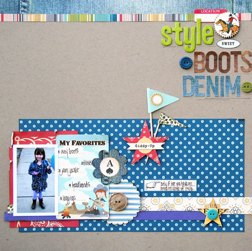
I went with lots of blue accents on this page. I wanted that color to be prominent. I also wanted to pop the red in the right places, near the photo and toward the title. But what to do about the purple? How about a strip along the bottom...it connects her photo to the layout.
Since this layout is about her style, including her jean jacket...I had to use the denim paper along the top. I love how these alphabet letters from OA look almost stamped on....I used the Feb. kit from My Scrapbook Nook to create this layout.
To add more details, I layered up the star here. Aren't the flag super cute!
I love how the journaling card and button all go with the theme...
and how they go with the purple. Original color scheme or not.


Can't believe it. No comments. Here is some love for your. Your pages are always inspirational.
ReplyDeleteSeriously COOL!! I know I left a comment here but it must've been eaten by the internet trolls. BAD trolls!
ReplyDeleteI love your style, and how effortless you make it look. Super cute photo too! :D
Very cool girls layout, love how you used the Feb kit!!
ReplyDeleteYour style is just amazing! This layout is stunning!
ReplyDeleteLove, love love it!! Such a great design!! Love so much your work♥
ReplyDeleteStunning. I am loving what you are creating with the February kit.
ReplyDeleteThis is soooooooooo adorable!! Love the denim and the little star. And of course her sweet photo.
ReplyDeleteoh my gosh this is so cute, that photo is perfect for this line :)
ReplyDeleteWe give you the best ideas, tips and content surrounding: Beds, mattresses, interior furniture, headboards, frames, accessories, and much more.
ReplyDeletehow to choose bed sheet color