Friday, March 29, 2013

Lily Bee Blog Hopping

Happy Friday everyone! Welcome to the Lily Bee Design Team blog hop...you may have seen a couple of our new design team’s projects on the blog already but we thought it’d be fun to showcase the talents of the team by doing a blog hop!

6a014e86b0613b970d017ee41c06bc970d-800wi

Our blog hop continues with this week's theme of Spring / Easter projects! I have created a page that shares one of my favorite photos from last Easter.  My daughter put on fuzzy bunny ears and I was sold!


I used the new Sweet Shoppe collection for this layout...it was my first time playing with the line.  I found it to be super fun!  I focused on combining the softer pastels in the collection since it integrates an Easter theme.  The "You are Sweet" chipboard piece caught my eye so I gave it center stage!


I decided to frame the chipboard and photo with the label stickers.  I ended up turning the two vertical ones into exclamation points!  All of the new collections are beautiful and offer up a ton of possibilities!

I am so excited to be a part of the Lily Bee team for another term!  The design team is so talented...I just know that I will grow and learn through their inspiration!  Each member has created an inspirational project using our new collections, so make sure you stop by each of their blogs to see their work and leave them some love.  When you are done, head back over here for a chance to win some Lily Bee Design product of your own!

Adrienne Alvis
Becky Williams
Christine Newman
Cindy Liebel
Diana Fisher
Diane Payne
Heather Leopard 
Leslie Ashe
Nicole Nowosad
Patricia Roebuck
Stacey Michaud
Summer Fullerton
Wendy Sue Anderson
Lily Bee Blog

Here is how you can win!
GIVEAWAY!
Sweet-Shoppe-BadgeWe’re giving away a Sweet Shoppe paper pack! 
  • Comment on the Lily Bee blog post by midnight ET on 3/31/13, letting us know you completed the hop
  • FOLLOW the Lily Bee Design blog in the upper right hand corner of our blog
  • Like our Facebook page and share the blog hop link with your scrapbooking/cardmaking friends! Be sure to tag @LilyBeeDesign 
  • Bonus: Make sure you are on our Newsletter mailing list
Good luck and have a great weekend!


Tuesday, March 26, 2013

Be My Guest: Punky Sprouts

I always love the opportunity to work with different companies...there are some diverse and gorgeous products on the market!

I had the chance to work with one of Punky Sprout's mini albums, Soul Sprout.  It is the perfect size and it comes with a variety of pages...most chipboard, one tag and one canvas page.  It was a blast to mix it all up.

Here is what I created!


I made a mini about our favorite summer memories!  I used this fun, bright line from Carta Bella called Alphabet Junction...a real treat that was included in my box along with the album.


I layered patterns and stickers from the collection, focusing on using numbers on each page.


I love this tag page so much...a perfect spot for journaling.


I know I will appreciate the memories that this album shares, especially when the kids are grown up.


I am honored to have been a guest designer for Punky Sprouts!  Be sure to head over to the blog and website to learn more about their great products!


Sunday, March 24, 2013

At Home: Powder Room Renovation

Home sweet home...we are well on our way through the renovations of two bathrooms.  One is the downstairs half bath/laundry space and one is the master bathroom.

I am happy to say that the downstairs half bath is just about done.  The dryer needs a little easing into its spot and I plan to install a counter above the new washer/dryer.

Here are some images of the new room.


We kept the same footprint, but everything else including the floor and all fixtures are new.  We installed the beadboard and I painted the top half of the room Storm by Benjamin Moore.  It is a lovely deep gray!

I purposefully looked for a bold print with lots of color.  Yellow is my accent as you can see with the cafe curtain on the window.  I will be back soon to explain how those were made!


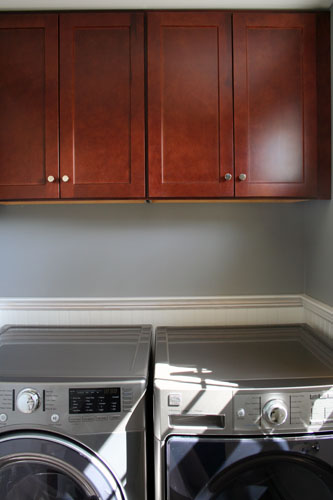
This is the opposite side of the room...I went with warm wood cabinets because gray and chrome can be cold.  I tied the wood into the other side of the room using the two small shelves.  Love these new washer and dryers.  They sound like spacecrafts when they are running!  There will be a counter across the top...then I will have to shop for more decorations!


I so love this pedestal sink.  It is the Archer model by Kohler and my faucets are American Standard.  I like a modern country mix so I went for a vintage feel.  I love my vanity lights, a real find at Home Depot for only $80.00.


The pretty faucets...Portsmouth from American Standard!  I added the towel and soap pump from the new Threshold line at Target.  Like I needed another reason to shop there.

I love the bathroom and how it updates the downstairs!  The master bath is about halfway done...and we are getting excited!

Thanks for stopping by!


Wednesday, March 20, 2013

A Card with a Suprise

Happy Wednesday!  Almost the weekend!  Today, I am sharing  a card with a surprise. 

I was recently challenged to go through my Webster's stash and mix old with new.  A little spring cleaning...

I fell in love all over again with each and every older collection and embellihsment.


I started with the journaling card and simply starting layering other paper.  I added the beautiful butterfly and sticker.  Simple, yet pretty.


Inside is a new mini bag, glued right down onto the card.  It is the perfect place to put a gift card or cash or tickets...crackers?

Anything that makes it a surprise!


Monday, March 18, 2013

Monday's Musings: Just Let Go

Steve and I...we are a good team.  So much in common.  Similar wants and needs.  We are both workers and will get the job done.  He told me that he works hard just so he can be lazy.  I suppose I work hard so I can scrap...

We like order, neatness.  In the middle of this renovation, we have started to go crazy with the dust and the mess.  It is not our first time at the rodeo, but it still bugged us.

Then...a leak we didn't see coming.  It came.  It was raining in our office.  In my scraproom.  The water took part of the ceiling down.

Somehow, it landed only on the carpet.  Our TV, computer and printer weren't touched.  The water fell 8 inches from my photographs, adhesive and scrapbooking goodies.

We were left with a mess.  Way more than dust.  Scrap stuff in the dining room.  Steve and I knew that it was a sign to let go.  We are not in control.

We were left with a mess but we were lucky.  Nothing valuable was destroyed.  Our contractor quickly fixed the ceiling, which had to come down completely.  Six days later, I sit in the very same office.  It happens to be much nicer now without the popcorn ceiling.

In the midst of it, I created a layout.  Old school...sitting at my kitchen counter.


I had to get creative with the paper I had at hand.  It was fun to do.  I made this layout using Lily Bee goodies.  To hear more about my approach, head over to the blog.


Surrounded by mess and dust, I tried to remember what was important.  What matters.  I think it helped me create this layout...helped me share the love I feel.


Ceilings can be rehung and walls can be painted. Messes can be cleaned up.  The important stuff is right there.  When you let go enough to let God.


Thursday, March 14, 2013


Super excited about this...


DT Announcement


The new team will be sharing our creations with you starting next week.

Be sure to follow the Lily bee blog as well as FacebookInstagramTwitter and Pinterest. We offer unique promos/giveaways, sneak peeks and more on each of these social platforms! You can also sign up for our e-newsletter, so you can be one of the first "In the Know", get the skinny on current challenges, tutorials, new products and more. Click HERE to sign up.

I will miss working alongside the very talented outgoing team members, Andrea BudjackDeanna MisnerMelissa MannMelissa Stinson, and Ursula Schneider

I wanted to share a recent layout I completed using Lily Bee Destination.  Love this collection...the new embellishments are soo, so good!


Thanks Kristen for another term!  I cannot wait!


Monday, March 11, 2013

Monday's Musings: You Made a Funny

Nathan....we are not sure where his sudden wit and sense of humor comes from.  He seems to pick the just right catch phrase or saying to match the situation.

It is more grown up than before.  Don't get me wrong...he loved the Three Stooges movies with all the slapstick.  Farts are funny to him as are any body part.

But, there is this other way of his thinking...he is a funny guy.  Steve and I often giggle and then look at each other.  Because we sense a shift in him.

I adore his laugh and his smile.  This random photo I caught while he sat on the front porch shows his beautiful grin.

It deserves a layout!


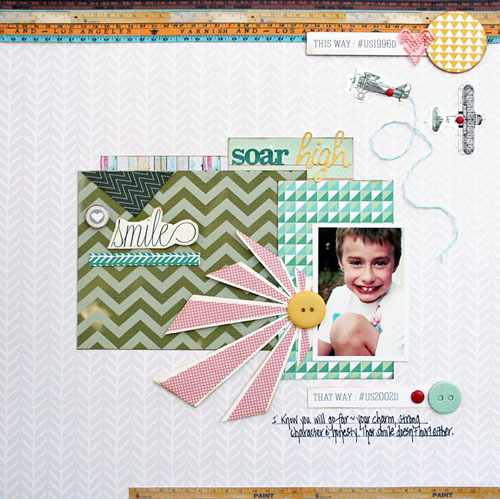
I focused on using the overlays from the Composition & Color line as well as the trim.  I placed the chevron overlay on the olive paper....It has this cool effect!  


I also cut the airplanes from an overlay and used them to add a special detail to the page.  I added the red brad to hold the planes down and created "flight swirls" from the twine.


Special touches!  For my special guy!


Saturday, March 9, 2013

Sunburst Saturday

I am addicted...the little sunburst in Allison Kreft's new collections.  I have used one on every layout I have made with her products.  I know I should probably be careful about overuse, but I can't stop myself.  It is like a really great necklace that goes with everything.

I have this adorable photo of my guy.  His smile makes my day.  I wanted the sunburst to convey how it glows.  Along with the red sunburst, I focused on the overlays and trims on this layout.


I used the ruler ribbon along the top of my layout...it adds a really nice texture you can't see from a photo.  I also cut the pink scalloped trim to make that little heart!


See the airplanes...they are from a sheet of overlays.  I decided to only use a couple and place a red brad in the center of each one. The blue twine is from the Composition & Color line.


I placed the white chevron overly from Sweet Notes over the green cardstock...I love how it pops and mixes with the other greens.  Ahh...the sunburst.

This layout uses mostly Composition & Color, but I mixed in some Sweet Notes too!  All Webster's collections are now shipping. 

You too can become a sunburst addict.


Thursday, March 7, 2013

Thursday Tip: Tone on Tone

I have been considering paint colors for my bathrooms...there is so much to consider.  Do I want a pop, a contrast, or a quiet color?

Scrapbooking is the same way.  Every time you design a project, the color palate is key.  I tend to gravitate to warm colors, vibrant hues.  But lately, I like monochromatic and soft.

I went with soft pastels for my most recent project.  I made these paper candy cones for Easter.  Simple, easy...so pretty!

Choosing the base was so important because I wanted pattern and texture with a quietness.

Here is what I made using Teresa Collins goodies!


Soft whites with grays, a touch of pink for the base.


I added in yellow and some green for a little contrast!  I filled each cone with paper and candy.  Well, I ate a lot of the candy first...


I also created a simple centerpiece...I love glass bottles and white ceramics.  The simple washi tape and ribbon around the silver metal pot is just enough for me!


All this tone on tone...influencing me around the house too!


Tuesday, March 5, 2013

Tuesday Tip: Use a Part of It

Worried about the length of a ribbon or piece of fabric?  How about the size of a doilie or chipboard piece?
Too big...no such thing!

If there is an element you love, but the size doesn't quite fit the space...you use a piece of it.

Take the Story Marker from Webster's Pages on this page...  I love the Story Markers, but I only needed a touch...just a little bit.


I decided to cut a bunch of the Story Marker off...I plan to use the extra...it is soft and pretty fabric so why not?  I tucked the Story Marker under the Perfect Accent...a great combination. I used the Park Drive from Webster's Pages to create this layout.


To make my title stand out, I underlined it with bling.  Again, this bling came from a long piece of jewels.  Now, it is customized.

Find an element you love, use it...no excuses!


Sunday, March 3, 2013

Sunday At Home: What's for Dinner

We are deep in the renovation now...that phase where the drywall dust in everywhere.  Where all the fun things are waiting in the garage.  The phase where Steve and I have to let go of our need for order.

As such, my house is upside down.  I figured I would spend Sunday at home sharing some of my favorite recipes from the past couple of weeks.

With the change of the seasons, I get bored of the common dishes.  This past week has been about changing it up and trying new things.  We try to eat very healthy so I look for meals with natural ingredients and meals from my favorite clean eating blogs.

I have loved:


Butternut Squash and Black Bean Skillet from the Ambitious Kitchen blog.  I used ground turkey in this and used multigrain tortillas...this recipe is simply amazing!  I make mine in a regular skillet and put it in a Pyrex for the last part.


Crock Pot Picadillo from Skinnytaste!  Wow, this was good and easy!


Cilantro Lime Shrimp from Never Enough Thyme...this is spicy and really delicious!  I used frozen shrimp and served with a salad!


Salmon Cakes from The Fit Cook....my kids even loved these...very yummy even though they didn't stay together when cooking.  I didn't follow directions to use two spatulas though, so it was my bad...

You never know when trying something new, but I have had some great success this past week!

What's for dinner in your house?


Saturday, March 2, 2013

Friday Tip: Underline that Title

I am really into grounded elements on a layout.  I think it is why I am so rigid with floating elements and freedom...although I realize I need that in order for work to be non-static.

So, how can I ground and yet have moment.  One tip involves underlining my title.  I often like to use mixed fonts, which works great with underlining.  It keeps a straight line versus the random sizing of the letters.

Underlining can be done with a pen or even with paper.
Little strips.

Here is a recent layout using the New Beginnings collection from Webster's Pages.  If you are looking for a sweet spring collection and one that works great for Easter...check this one out.


I love the pinks and greens in this collection.  I decided to add some curves using the oval Perfect Accent, the doilie and the hand cut Easter eggs.  I feel like my title would have been floating around so I put the yellow paper under it.  Gives it a bit of pop!

I used the blue and pink alphabet in different sizes and prints.  The Celebrate banner was cut from a sheet of paper.


Interest, and movement...yet grounded.

If only I spelled ninja right on the layout...ugh

happy day all!


LinkWithin

Related Posts Plugin for WordPress, Blogger...