Thursday, January 30, 2014

An Old Photo in a New Way

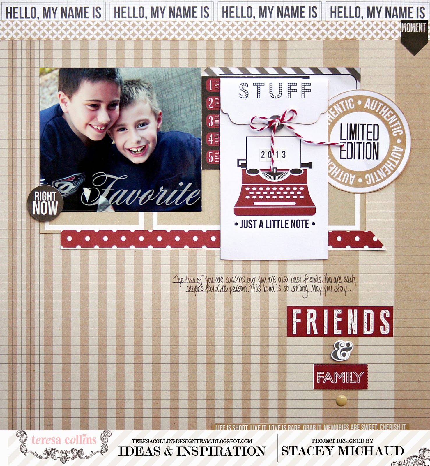
Sometimes I get into these funks where I simply don't take photos.  How many pictures of my kids smiling do I need?  Just kidding.  It is more the lack of time and energy.  While my photos are always new, I might get some new products and be inspired to tell a story.  I will pull out an old photo and use it in a new way.

This is a perfect example.  I love this photo of my son and nephew.  The bond they share is great and you can see it in this picture.  So, I wanted to scrap it and talk about how close they are.


I love this new collection from Teresa Collins!  It is called, Hello My Name Is.  The kraft and red are a great combination.  It is a fun line full of really cool embellishments. 


I love the new tags that come with the collections. Words and images can really set the
tone. That is totally Teresa's strength and she helps me tell my story!
 
I adore this photo, old or new.  So why not use it? 


Monday, January 27, 2014

Monday's Musings: She Had a Bad Day

Don't we all?  My daughter has talked to me today several times about how today was just plain hard.  Things didn't go well for her, according to her.  She gave me a list of things that weren't in her favor.  Getting snapped at by a cranky mom probably didn't help.

I went upstairs to tuck her in and found her crying in her bed.  My heart broke.  I asked her why and she said again how bad her day was.  I told her a little secret.  Everyone has a bad day.  The good thing is that the day comes to an end.  You can wake up to a brand new one.

I also told her that she could always call me when she was having a bad day.  Even if she is 28 and living in Utah.  She asked if we could face time.  I confirmed that as acceptable.  She then informed me that she would probably never live in Utah since she never even heard of it.

Those small moments in life are so important.


I hope to be there for her.  Even when I am cranky.  I hope she knows that we all have bad days.  It is what you do the next day that matters the most.

 
I used Webster's Pages from my stash.  I love the soft elements on this page.  These photos capture Ella at her most vulnerable.
 
The small moment we had tonight will help us both identify who we are and what we know to be important. 
 
So maybe it wasn't such a bad day after all.

Friday, January 24, 2014

Boys Are Cool

It seems so easy to make layouts about my daughter...so many paper lines are geared to girls and I have far more pictures of Ella than of Nathan.   She loves to pose, where I have to beg him.

So this Christmas, I grabbed the boys in the family and made them pose.  It worked because they were in a group.  Then I found a great collection to use, We R Family by Lily Bee.  It has a great navy, green and red combination.

 
I mixed lots of rectangles and then tried to change it up with other shapes.  I like the wood veneer shapes so much!
 
 
I mixed two different alphabets to make my titles, adding in little details like the enamel dots.  I also built the arrow to the right, using strips made up of triangles.

 
It was a fun page to make and it is fun group of cool guys! 
 

Wednesday, January 22, 2014

Tuesday's Tip: Go Back

I remember when I started designing for Webster's Pages, well before Clean and Simple was a part of their approach.  I used the products differently than most classic WP designers.  Honestly, I love all the fussy layering and artsy stuff.  I just can't make it work.

But my style back then was a little more feminine,  I used more fussy cutting just in a cleaner way.  There were more patterns on a page and more bling.  My style may have changed a bit, but I know my roots.

It was fun to go back to a more classic Webster's approach when I was making some pages for the trade show.  I used one of Brandin's new collections, Party Time.  This page has a familiar feel to me and I like it.

 
I still have lots of straight lines, but I added lots of pattern, color, shapes and size.  I hand cut the garland from a sheet of the paper and layered it along the bottom of the top portion of the page.  I added in this cool sun, using straws to add dimension.
 
 
I also fussy cut that cluster of presents and the stars at the top.  I love Webster's because of this very reason.  You can cut, arrange and use each element in a unique way.  Every page is different.
 
It was fun going back. 
 

Monday, January 20, 2014

Monday's Musings: So Many Happys

Today, my family says goodbye to my grandfather.  He was 87 years old.  He was married to my grandmother for 66 years.  It is amazing to think of all the happys he had in life.  Many of them involved family vacations to Maine, when we would invade his house.  He made it a home for all of us.

I went back to my childhood summer vacation place this past August.  I hadn't seen him in 20 years.  He hadn't changed a bit.  Witty sense of humor, warm and inviting.  I am so happy I made that trip.  Happy that my kids and husband got the chance to meet such a great guy, such an inspirational couple.

Four girls used to invade his house.  Me and my sisters.  We grew up there each summer.  This page shows the next generation of girls.  Four of them again.

 
My daughter and nieces, all spread out in ages, yet bonded.  Look at those smiles.  Those moments, watching these girls grow...it is one of my happys.


I love that moment.  I can relate to what my grandfather must have felt all those times he saw the smiles of all of his girls, my sisters and my cousins.  I hope he holds onto those smiles as he looks down from heaven.
 
 
Rest in peace, gramps...

Thursday, January 16, 2014

Thursday Trending: Anything Woodgrain

Happy Thursday!  Today, I am sharing a recent layout that was featured at the Lily Bee Design blog.  It showcases many of my favorite things about Lily Bee.  It showcases one of my favorite things, anything woodgrain.

One of the trends I am loving is the addition of wood veneer embellishments.  This page not only uses wooden embellishments, but shows off one of Amy Heller's woodgrain sheets of paper.

 
I tried to position the center of the sunray between the photo and the cluster.  I think it ties the two together.  I also mixed two Lily Bee collections, Urban Autumn and We R Family.  I love the purple with the green. 
 
 
Another one of my favorite things, the metal badges!  I like to tie mine off with twine.  I also created this cluster below using some hand cut elements as well as some dimensional embellishments such as the Sweet Spot Enamel Stickers.
 

Just a reminder that Lily Bee is having a design team call!  It is a great gig with some seriously creative friends!  Be sure to get your application in before the deadline!

Think of all the great woodgrain!


Monday, January 13, 2014

Monday's Musings: Knocking Down Walls

This past year has brought many blessings.  Knocking down walls has brought much more joy into my life.  It has enhanced the good and helped me deal with stress more effectively. 

I made this page to document my willingness and desire to be open.  For too long, I have shut out noise and conflict and even laughter.   With this page, I declare a different way.


I explained the symbolism and meaning behind this page over at the Scrapbooking From the Inside Out blog.  I carefully chose theses elements to represent my feelings.

 
Every Monday this month, I am sharing more details about my pages using the Empathy kit.  The entire, very talented team at SFTIO is doing the same so be sure to visit!  You will be inspired!


Sunday, January 12, 2014

Why Not Christmas?

So, Sunday At Home is usually at time for me to post décor updates or pictures of our current events, but today...something different.  I am purging, organizing and getting on track.  Closets are being rearranged and workouts are occurring.  We are making our vacation plans and looking forward to a great year. 
 
In looking through my files, I realize there are over 10 layouts I haven't shared.  So, let the organizing begin.  I am going to share this page made many months ago.  I figure it is a good time since Christmas just ended and we all have pictures ready to scrap.


I used Webster's Pages to make this one.  I am more on the Clean and Simple side of things, but I am always drawn back into classic Websters.  I started out using Brandin's elaborate and beautiful papers in a slightly different way than what was tradition.  It is fun to go back to those roots.

 
I used a bold green background on this page.  I love how photos pop off this color.  To add some variety, I cut the diamond patterned paper, removing the middle. 

 
I created a cluster using many handcut elements like the tags, present and snowflake.  I love how Websters allows for such uniqueness!
 
Cleaning can bring good things...
 

Thursday, January 9, 2014

Going with a Theme!

Sometimes there is a sheet of paper and you look at it....idea triggered.  Staring at paper and letting the mind generate thoughts allows for new ideas.  I like when that happens.

That happened on this layout I made using the January kit from Scrapbooking from the Inside out.


I saw this blueprint paper and started brainstorming.  The idea of a foundation came to mind, which led me to the thought of Ella's grandparents.  A layout was born!


I love the variety of all the items in the kit.  There is this cool mix of embellishments that really stretch creativity!  

Tuesday, January 7, 2014

Tuesday Trending: White Backgrounds

Happy Tuesday!  I have been scrapping a ton in preparation for CHA and I find myself so attracted to white backgrounds.  I can't help it...I need a quiet place to start.

I used an all white background for my most recent Lily Bee layout. 


Since I used a black and white photo along with a white background, I wanted to add some color.  I loved the boy/girl card and put it right right to my picture.  That didn't help much with color so I went to the top of the page.  I added that beautiful navy paper.  I then started to add hanging strips of paper.  I cut this from one of the We R Family sheets of paper.  I just made them all different sizes.

I always lay out a design like this one before I glue.  I really like the effect and all the color it adds.


I went back to my stash to put in some details....see the rub-ons and chipboard!  


Have you seen the reveal of the new Everyday collection from Lily Bee?  Kristen shared it this week and it looks just awesome!

I think white backgrounds are a mainstay for me!  Now I just have to remember to go bold sometimes too!


Friday, January 3, 2014

Inside Out Art: Speaking Love

Happy Friday!  The East coast has had a snowstorm so I had a nice cozy day off from school.  I am sharing a new layout using the Empathy kit from Scrapbooking From the Inside Out.

I will be over at the SFTIO blog each Tuesday this month to share my thoughts behind the pages I made.  I will share how I use the kits to symbolically represent my emotions.

I love how whimsical and mismatched this page is...it really is about the title.


I used elements in the kit to build my title!  I also wanted to jazz up the white background so I used the Faber Castell Gelato from the kit to make those dots.  I rubbed some Gelato on a paper plate and kept putting a pencil eraser into the gel, making polka dots on my paper.  It was relatively easy and gives the page another layer and texture.


I really loved this kit and can't wait to take this journey each month!

Thursday, January 2, 2014

Top Ten of 2013

I always love looking back on the year and choosing 10 of my favorite layouts from the year.  When I was picking pages, I think I focused on ones where there is a story to tell.  I also love using different techniques.

My top ten:

I adore this photo because I used to look at him that same way when I was her age.  I still do...


Again, I love this photo and how it captured Nathan's innocence!  I also have a thing for Allison Kreft!

 
I just love how mixed and unmatched this is.  Freedom on a page.


This one is just pretty and I love how sweet Ella looks.  It is one of those girly, girl pages.


I love good Instagram photos and this is one of my favs.  I like the blocks here.

 
 This one is newer, but I love what it stands for.  Those little hearts represent so much!
 
 
I just love the dark background on this page.  The whole thing is symbolic and funny to me.

 
One of my very favorites.  Love Nathan is this picture.  And I adore this technique!

 
Again, the meaning and story behind this page touches my heart!  I just love the retro color scheme and that map!
 
 
 This page shows my boy at his best, busy and drawing.  I love all the little elements.

 
It has been a good year creatively.  I am so lucky to be a part of some great teams.  I am looking forward to this year and just experimenting with art!


Wednesday, January 1, 2014

Happy New Year!

Happy 2014!  I have to say that 2013 was a fantastic year!  I had some amazing moments with friends and family.  I am hoping 2014 can bring the same!

I have a great announcement or two!  I have joined the new team over at Scrapbooking From the Inside Out.  The concept behind this kit is just awe inspiring.  Each month involves an emotion and all of the pages should be connected to that emotion.  Kit contents are geared to that feeling as well.

It is such a creative concept and I love the items in the kit.

Here is one layout I made using the Empathy kit:

 
This layout is fitting for today!  I have loved this year and all my years with this man.  He sees me, gets me, understands me and gives me room to grow.  I couldn't be happier.  It is not always perfect, but we are perfect for each other! 

 
I love this little wooden hearts from the kit and scattered them all around!  I colored in my title letters using a gel stick!
 
 
Of course, the story.  These words sum it up for me.  I know that 2014 will be just fine as long as this guy is by my side!
 
 
Announcement two is good....I am staying with the Teresa Collins Team another year. 


I think her collections get better each year.  I spent this past week creating for CHA and I am in love.  So many cool new elements...be on the lookout all this week!  I am lucky enough to be alongside many talented designers.  Go check out the team over at the TC blog!
 
It is a great first day of the year!
 

LinkWithin

Related Posts Plugin for WordPress, Blogger...