Sunday, September 29, 2013

At Home: Boy's Room Update

For months, I walked by Nathan's room and wanted to change it.  Some of the furniture was too bulky and the color scheme just didn't fit.

We started brainstorming what he might like.  He wanted baseball and maps.  I thought those two things could work together.  I pinned a ton of inspiration!

My first goal was to add stripes in order to update the light blue wall color.  I like it, but it was too much.  I wanted to make it a space he could grow into as he gets older.

The results:

 
The light blue was already on the walls.  I updated it with the gray paint on the top and the navy and orange stripe.  Stripes are not easy.  Frog tape and all.  I had a ton of leaks and squiggly lines on my first coat.  Then I researched how to add stripes using a sealing technique.  It worked like a charm.  It is extra work, but was worth it. 

 
It is a small room with only one window.  So space planning is key.  I wanted a small desk that fit the space nicely.  I got this gray beauty from Target, online only. 
 
I originally wanted a vintage roll down map.  Boy, are those expensive.  Then I started looking online for other options.  Most were $75.00 plus dollars.  As the start of school got closer, I realized that I should check the teacher's store.  I scored that world map for $20.00.  It is perfection!
 
 
This is a gallery wall that I made using Target frames and my scrapbooking supplies.  Seriously, the whole thing cost $25.00.  I will be back soon to share some detail shots!  The art helped me bring in colors I wanted to emphasize.
 
 
This is his baseball and sports area.  I hung the key hook up and decided to use it to display his sport's medals.  It adds to the wall without being overwhelming.

 
His bed area displays his baseball pennants. I combined different bedding, going with a gray and white striped comforter from Target along with orange and white sheets.  I love mixing bedding! 
 
He loves his room and has thanked me so many times.  Now when I walk by, I am just happy. 


Thursday, September 26, 2013

To the Right, to the Right

There is something about a design that is heavy on the right that just makes sense to me.  Bring the elements across the page and then load it up along the right hand side.  Picture is balanced by the heavy side.  There are only so many ways to configure a 12 X 12 page.  So the design might stay the same while the elements change.
 
 
I created this page using a favorite photo.  This is my dad's side of the family, all of us together.  It brings back great memories.  I am so glad we caught this family photo.
 
I documented how we have to travel to get together!  I love these chipboard pieces of the globe and the plane.
 

Here is another view.  Sometimes when I need to balance a page out or add that missing element, I use my pen to draw lines.


A familiar design, but a unique page because it tells a story.

Follow">http://www.bloglovin.com/blog/1506215/?claim=drpyv4mv6tz">Follow my blog with Bloglovin

Monday, September 23, 2013

Monday's Musings: Way Back When


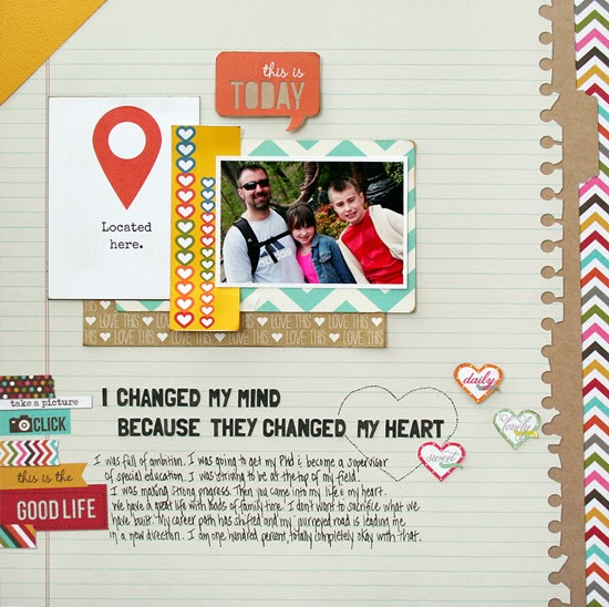
Way back when I dreamed of being a writer.  I published many novels when I was in the second grade.  Then I discovered that I would really love to teach.  I knew at a young age that I wanted to work with students with special needs.  For a while, I had dreams of opening my own school to give students a place to belong and a place to be taught.
 
I went into teaching.  Was I driven...I had plans to become a principal or director of special education.  My ambition was strong.  I joined committees and got my master's degree.  I was focused and moving forward.
 
But then life shifted.  One relationship didn't work out as I expected.  I blame some of it on being a workaholic.  I was absorbed. 
 
So when I found the man I would build my life with, I shifted.  We have a great life full of loads of family time.  I don't want to do anything to mess with what we have created.
 
When I was asked to scrap with the theme of ambition, I immediately thought of how my career path has shifted.  I am located in a place where teaching suits me just fine.  Being a wife and mom suit me even better. 
 

A layout like this is why I started scrapbooking in the first place.  I wanted an outlet to describe my feelings and communicate all the parts of my life.  This one is very personal.  I used the September kit from Scrapbooking From the Inside Out to make this page.

I adore what I do for a living.  I love the kids and the families.  I am not ready to be away from that day to day interaction.  I love that my career allows me to be passionate about what I do, while also allowing me time to be passionate about who I am and who I love.

 
My journaling, which shares the story.
 
 
Life has a way of shifting, of bringing you right where you need to be.  Those dreams and goals developed way back when morph into the here and now.  When I reflect, I am content.

Friday, September 20, 2013

School Rules


School is back and I am feeling it!  I really love my caseload this year and am feeling focused and enthusiastic.  But, I am tired!  The adjustment in the daily routine is tough.  Fall sports and afterschool activities are in full swing.  I took this whole week off from scrapbooking as I had zero energy.   It will balance itself out, soon.
 
In the meantime, I am sharing a mini album that I made using the new Recorded collection by Allison Kreft for Webster's Pages.  I think this is an all time favorite collection for me...in the top five for sure.  I used the journaling cards as the pages.
 
 
I held the book together with the buttons and twine!
 
 
Each pages features journaling about our school morning routine.  I used the paperclips and overlaps throughout. 


I used an overlay on the last pages...these polaroid frames are great!  I adhered mine with the button and twine!


Minis are fun...I like to keep mine simple and clean!  Recording everyday routines in a mini album is a fun way to document our family history!

and our family history certainly involves school.


Monday, September 16, 2013

Monday's Musings: Hear Me Roar

I believe that people are capable of change.  They can grow and learn and adopt new ways.  However, I don't think anyone can make you change.  Only you have the power to jumpstart that renewal and to keep it going until you have found a new way of being.
 
I set goals all the time.  Usually the goals are centered around career or fitness or basic to-do lists.  I set goals for what I wanted to achieve in this industry.  In the recent years, the goals have centered around how to change those bad habits that continue to haunt.  I wanted to get rid of the usual and very ineffective way of dealing with things.  We learn our coping strategies at an early age and it is hard to work out of those even as a 42 year old.
 
But I have worked hard, have reflected.  The most important thing is that I opened my heart.  I fully and whole heartedly wanted to change...to become more compassionate, to let myself love freely with kindness.  There is a contentment within my soul.


I am quiet inside.  I feel stable and strong.

 
I used this title before Roar hit the radio...LOL!  I used the September Scrapbooking from the Inside Out kit to make this layout.
 
 
There are so many cool elements like this cardstock woman cut-out and the star flair button.  The elements really are an expression of how I am feeling.
 
The best part is that change has this snowball effect.  One good thing leads to another.  An open heart equals better relationships equals a more open heart.
 
Perfect!


Friday, September 13, 2013

Special Announcement: Teresa Collins eBosser

I am here to share good news...the kind of news that involves a giveaway!


All this weekend, you will have a chance to win some fantastic prizes! 


The first 250 people to leave a comment will enter for this giveaway. You need to comment on each and every blog on the hop in order to be eligible.  
 
Rush to the Teresa Collins DT blog for more information!  Be sure to start at the Craftwell blog on September 14th!  This machine is awesome! 
 
Good luck!


Wednesday, September 11, 2013

Be My Guest: Scrapbooking From the Inside Out

Wow, this week has been busy, crazy, full.  Work is back full force and I am trying to adjust.  I have been creating...I just need to find time to photograph my projects!

Today, I am sharing a page I made using the SFTIO September kit.  It is full of Glitz, Webster's, and Simple Stories.  The thing I love the most about this kit is the direction to focus on one emotion:  ambition.

I am a bit over-ambitious with my desire to renovate.  I can't help myself.  Everywhere I look, I see possibilities.  I can happily say that I don't have any major or minor renovation plans in the works.  Well, for this week, anyway.

I made this layout to document my constant to-do list.  I blame it on Pinterest.

 
I grouped this cute symbol of a girl with the journaling card and my photos.
 
 
I love these cute rub-on push pins and wanted them to have a starring role on this page.  I thought of using them to hold up my to-do plans on the calendar. 

 
It is a fun kit and I am glad that I could make pages about topics that I might not have considered otherwise!


Sunday, September 8, 2013

At Home: Great Room Updates

Happy Sunday everyone!  The past year has brought many changes to our home.  We have renovated and painted, relocated items and added layers to each room.

Today, I am sharing some updates we have made to our great room.  It is a nice space, roomy and full of light.  My kids basically live in this room!

When we moved in, we totally gutted this room!  I decorated it once right after our big renovation.  Here is the room before the updates:

Before: 


Now:


Many of the elements have stayed the same...paint color, rug, sectional, and TV unit.  


This couch rocks!  Perfect for family living with young children.  When it needs replacing, I may go lighter, but for now...it is just right!  I added some color with throw pillows and patterned lampshades.

 
The main addition to this room is the leather chair.  We had this is our first house, right in the living room.  When we moved here, the chair found its way to the basement, which is fully finished.  It was just wasting time down there.  Steve and I decided to move it up and see if it worked.  We love it in this corner! (Keeping it real...notice the iPhone charger under the chair!)


Here is the other side of the room, which includes a dinette and wet bar!

One of the things I am learning as I decorate my house is that I often have treasures in the rooms around me.  I am learning to shop my own house first and then buy later!  That approach has helped me create a great room that suits my family!


Friday, September 6, 2013

That Silly Girl Phase

Ella has had a growth spurt.  She is changing.  Her silly girl phase is morphing into this funny and savvy sense of humor.  She can hand out one liners at the perfect time.  I have loved every stage (well, keeping it real....the infant stage was not my favorite), but I am enjoying these middle years.  This time where they need us, but have so much independence.

We went to visit my brother and sister-in-law along with my sisters and their families this past April.  I got some cut shots of the kids.  I love these of Ella and Riley.  Silly girls laughing and sharing a moment.


I decided to make this layout a bit girlie with a touch of navy and black.  I love pink with navy!  To achieve that feminine touch, I added the hand cut floral from a journaling card.  I used the Family Stories collection by Teresa Collins to make this page.


I added in a cluster to the bottom of the photo to make it the focal point.  LOVE that Teresa's collections are loaded with chipboard and brads and buttons and diecuts.
 
 
I love genuine smiles and captured laughter.  The joy of two silly girls!

Wednesday, September 4, 2013

Be My Guest: Scrapping From the Inside Out

I have the pleasure of being the guest designer over at Scrapbooking From the Inside Out.  I received a very full and very fun kit that fits the theme of Ambition.

This kit club is cool.  I love that there are themes each month that allow the scrapbooker to explore feelings and memories.  The emphasis is on journaling so you know I love it!

The September kit is full of Simple Stories and Webster's Pages along with some cool embellishments.  I quickly made four layouts and have more in mind for when school slows a bit.

Here is a page I made based upon the theme of Ambition.  I swear my kids make it a goal to see who is first, who is better, who will win ALL THE TIME!  It seems to be their life's ambition right now.  So I pulled out this photo and went to work.


I have a thing for speech bubbles and all they offer to designing a page!  I cut a bunch out from one of the sheets of paper in the kit...ones that matched my feelings and the situation.


I really loved using this template.  It is by Ronda Palazzari for Crafter's Workshop.  I traced the love with a black pen to make it stand out!

 
I want my kids to stop the quest for being the best!
 
Please check out the Scrapbooking From the Inside Out website to see more about the kit!

Monday, September 2, 2013

Monday's Musings: The Characters We Are

Each person in my house has a different personality.  We all serve different roles and contribute in a unique way. 

Steve is responsible and funny.  He is highly organized, but sometimes rigid.  He is the one who pursues a simple, happy life.  I am type A, a bit moody.  I am highly reflective so life is about how I can always enhance or treasure my relationships.  Ella is vivacious, energetic and outgoing.  She is highly helpful and sometimes fresh.  She is the one who is way too savvy for her young age, yet she gets things on a high level.  Nathan is loving and considerate, a bit too routined.  He worries a lot.  He is highly sensitive, which makes him always look out for others.  He is the one who teaches us about unconditional love and impeccable manners.

We all are different characters.  What I really care about is our core character.  We are models for each other every day.  I see Ella being helpful so it teaches me that virtue.  And so on and so forth. 
 
 
A fitting page as Nathan is dressed as one of his favorite characters, Harry Potter.  My children love to read, which makes us happy.


I used the Composition and Color plus some Sweetness, both by Allison Kreft, to make this layout.

 
What radiates from each of us is special.  It is to be fostered and shaped so we remain strong characters who possess even stronger character.


LinkWithin

Related Posts Plugin for WordPress, Blogger...