Monday, February 27, 2012

Monday's Musings: Can't Fight the Feeling

and I don't want to...

the feeling that my life is blessed.

I have a great family...

I really love my husband.  We have our share...but ultimately we are well-matched, we make a great team.  I had the opportunity to realize my devotion to him has never wavered.  I feel so strongly about us as a unit and my family as a whole.

That is where I am blessed.


And all my blessings have started in one place, with one great man...


Saturday, February 25, 2012

Wild Ride

Life is one wild ride.  So much is going on right now.  It seems like every moment is full of multitasking and planning.  It makes me feel like a 2:00 nap everyday.  We are getting ready for a busy spring full of Ella's birthday, Easter, a wedding and a vacation.  Oh, and Steve is having hip surgery.  I am just finishing the second week of P90X2, phase two.  I am loving this edition...loads, loads, loads of core. 

All in all, crazy schedule and life...it is all good.  I count my blessings.

I have started pinning images for Ella's birthday.  I love planning fun home parties with a theme.  This layout shows a highlight of Nathan's last party...these cardboard cars.  His face kinda sums it up:


I love this comic book paper from October Afternoon!  I have to use a section of it...it fits perfectly here!  I created the flag banner myself.  And notice the lasso:


This kit from My Scrapbook Nook filled with Sasparilla was among my favorites!  Love this paper line and all the wooden and textured goodies!

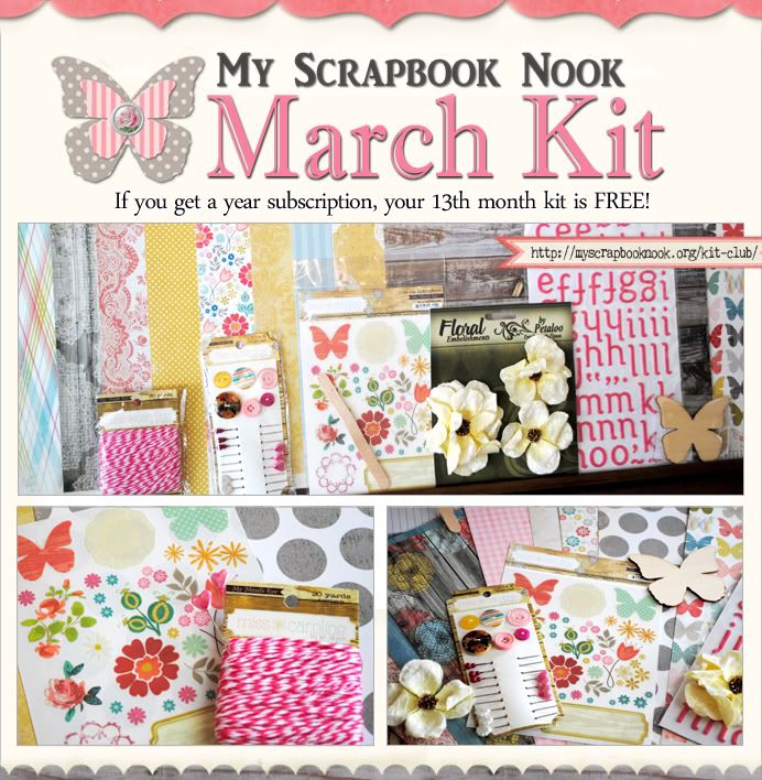
Here is the March kit...yummy NEW My Mind's Eye:


Look at how pretty...just in time for spring!  The Nook is offering a fabulous grab bag each month full of goodies that match the kit...for a super low price!  Be sure to check it out!


Off to go manage some crazy...Happy Saturday!


Thursday, February 23, 2012

Thursday Trend: Circles

Round, representing so much...you have come full circle, two are joined.  The circle is so full of movement.  It naturally leads the eye around a page.  I love the circle.  I tend not to use large circles because they don't feel right to me.  I adore when others use them, but it doesn't sit right when I am designing. 

I do love circles in small doses, tucked under a photo or placed in the corner.  Case in point:


This is the new Teresa Collins Fabrications!  It is so elegant and pretty!  It is no secret that one of my favorite elements from her collections are the die-cuts and chipboard.  They add so much to a layout, but don't take a lot of work.  I simply layered a bunch in a horizontal row.  But the layout needed more so I added some circles.  Little touches, but enough to make it interesting.


So, what trend is making your world go round these days?

Tuesday, February 21, 2012

Tuesday's Tip: Polar Opposite

I am a bit of a routined scrapper.  I am attracted to the same basic configuration of things including paper placement, photo clusters and embellishment spots.  I am most drawn to two photos, overlapping with one on a tilt.  I usually start right there when I am beginning a page.  I never sketch or plan, I just go.

Recently, I grabbed two photos of my daughter and grouped them.  And then I stopped myself.  Boring, I think I said out loud.  Predictable.  Do you want everything to look exactly the same? It is so static. (yes, these are the rants that occur in the head sometimes.)

I decided to put my photos on opposite sides of my layout.  Whoa...huge risk for me.  Some of you may be giggling at me.  But I am a linear girl.  I usually love predictable.

Here is what I created.


When I made the decision to have my photos be on opposite ends, I knew I still needed to ground things...connect them.  It wouldn't feel right otherwise.  So I brought in the garland.  The curves add a bit of movement (ha, not so static now!).  And they lead the eye from one photo to another. 

Then I added other details.  I wanted one of the photos to be the focal point so I clustered the embellishments in the lower corner.  Did you notice these are outside of my rectangle.  How about that for stepping out of the box?!

All products are from Pebbles, Inc.  I used the Fresh Goods line for this...I am so in love with that collection!


I ended with some repeating elements like the Kraft and blue flower.  One sits on each side of the page, going with the opposite theme.


I ended up being really comfortable with the polar opposite approach.  Maybe I will try it again!


Monday, February 20, 2012

Monday's Musings: You Really Don't Know What You're Made Off

Sometimes, you just don't know what you are made of until a challenge presents itself.  I think it can be an unexpected change at work, a tragedy (unfortunately), a once in a lifetime opportunity you never expected.  Once the challenge is clear, you have to decide how to handle it.  Do you go into it screaming  and ripping your hair out or do you fight it? Do you go in with your guard up or you embrace and leap?

I am bringing this subject up because of the layout I am sharing.  I will show you three beautiful baby boys...triplets to be exact.  A miracle and gift some thought would never happen.  And, never in any thinking, was there a belief that the luck would be multiplied by three.

But sometimes, God knows and he grants. Things outside of the realm of possibility suddenly become our reality.  So, my long time best friend, the career woman...city-wise and spontaneous welcomed these three loves into her life just over a year ago.


She is forever changed because of it.  She thrives in motherhood.  I see her come alive when she talks about them.  Who knew that she would undergo such a completely radical change in lifestyle and blossom in a new way because of it? We have talked many times about how it is such a gift to have three little guys running around.  Three cowboys who will experience everything together.


I am facing one of these types of challenges.  A great opportunity to be part of a family in a new way and to heal so many wounds.  I am going to embrace it and leap! 

Because sometimes you don't know what you are made of until you let go and let God.


Saturday, February 18, 2012

Good Family Times

We had such a good day yesterday...Ella and me.  We hung out.  She scrapped her own page and told her first story on paper.  I spoke all day with a quiet and patient voice.  She was helpful and loving.

Today, when I got home from being out all day, I walked into a moment of Steve and the kids playing hide and seek.  You could tell they had been playing for a while...counting and secret signals were happening.  And I giggle out loud. 

Happy kids.  I love it.  It means the world to me.  They don't always have to be happy, especially when they make the wrong choices.  I know they won't be happy during times of loss.  But they will always be grounded in love.

I guess a long weekend free of stress and full of hockey games, date nights and warm days helps create good family times.

I want those times to go on and on.  I want our kids to love each other as much as we love them.  Hence, this memory captured...they might fight and bicker.  But there is love under that.


The story behind this page:


 They are pretty super. 


Thursday, February 16, 2012

Thursday Trending: Free Falling

Welcome to Thursday trending!  I am sitting here wondering what trends I haven't tried much...think chevrons, hexagons, altering papers, ripping paper.  By the time I get to some of the trends, they are usually dead.

Then there are trends I can't stop using...banners, anyone!?  How about small paper strips along the sides of a layout?  Flags are pretty common in the scrappy world and on my projects! 

The newest trend I am loving is that free falling, randomly-placed-stuff-on-a-layout movement.  It sometimes looks like someone picked up a cluster of buttons or bling and threw them into the air...where they land is where they get glued.  I have actually tried that once or twice, but it never works out for me.  Toooo random.  So I pick the items up again and try a gentler toss in only one area.  That doesn't really count, huh?

The trick for me is to use the trend, but have it fit within my style!  I think the random works on this layout...it is at least something I can totally live with!  It only took me two point five hours to get the "snow" exactly where I wanted it.   LOL.

Here is my free falling:


Notice the snow falling from the sky. 


And of, course, a cluster...can't have a layout without a cluster!


I used the beautiful, bright Sunday Picnic collection from Webster's for this.  Mixed some Clean & Simple with the traditional papers! Yes, it is a spring collection...but it is also a winter collection!  I love how the colors match Ella's hat!

This is free falling...for me...controlled, yet random!

Before I go, I wanted to share that Bella Blvd's Feb. newsletter is up!  Check it out in this blog post and when you read it, keep your eyes peeled for a layout from me!  There is a ton of inspiration in this issue!


Hope you get some scrappy time today!

Wednesday, February 15, 2012

How-To: DIY Photo Holder

Every year around this time I start getting that feeling...I want to be warm, outdoors, redecorating.  I want to shake off the winter.  I know there are still many weeks ahead of us, but I just can't get rid of the feeling!

What to do?  How about some small changes like a new sign or pillow? (can you tell that I hit Jo'anns this week).  Speaking of Jo'anns...I bought some unfinished wooden spools there a few weeks agao.  I used it to make my own home decor item!

The one I just made would have to be put to use in my son's room.  I used the Feb. kit from My Scrapbook Nook to create it!  How about a covered wooden spool?  A little Mod Podge...


A decorated top and a button in the center?  I used a rolled up piece of scrap paper inside of the hole on the bottom of the spool.  A pencil end help me to push it up snugly and created a stable place to put my flag and photo holder wire.  See the technique of placing the flag and wire ends into the button holes.


How about a simple decorative front?  Sometimes less is more!  The twine and texture...yum!


When you are done, you have this little cutey!  It certainly helped to fill my "I must redecorate right now" feeling!  I love how it looks clustered with other objects from my son's room!


For complete instructions how to make your own, visit my class over at the Nook!  It will also be up on the blog this weekend!  If you make one, be sure to share! 


Monday, February 13, 2012

Monday's Musing: Love

Love...it is a crazy thing.  Strong and fierce, yet stable and quiet.  So sure, yet ebbing and flowing naturally as two people navigate life together.

I have had the chance to have some conversations about love lately.  You can feel it for someone, but not have it be quite right.  When love comes in that form, it is tricky.  Your heart might want one thing, but it is not meant to be.  There is that question, the not-sure, the nagging feeling.  I have felt that a few times in life.

And then, one day...it is clear, quiet, sure.  and you just have a knowing.  a contentment.  It is not perfect, but it is sure.  It is not full of roses and bubbles, but it is steadfast.  And when you both have the feeling and that belief, there is nothing else like it in the world.

That is Steven.

my sure, my steadfast, my ebb and flow, my quiet

except for when we are arguing or bantering!  LOL!  We have this teasing thing...this back and forth.  I see him the same way with his friends so I like that we can hang in the same way.  Sometimes, our banter makes other comfortable.  Sometimes, our banter turns into arguing...issues come forth.  We are heated like that.  There are things about him that make me want to scream and I know he feels the same about me. But that dissolves and we are left,

sure, steadfast, quiet...

I made this layout to document our banter, a component of who we are.  I hope we keep that playfulness with each other.  That we continue to be friends too.


Many of you stopped by the Pebbles blog this week and saw this layout!  Thanks for all the lovely comments!   I used the With Love collection here!  I love those speech bubbles!


I placed my journaling on them!  Our story...or at least part of it!  Because along with what we have accomplished, there is so much more to look forward to!

I know in my heart that all the hurt that came before led me right here...

in love with my sure, my steadfast, my quiet.

Sunday, February 12, 2012

At Home: Ella's Room

This was the first room I redid in this house.  We were still living with my in-laws, which meant Steve and I were set up in the basement.  The kids had their rooms though.  I needed to dig in and personalize one room!  Ella was the winner, mainly because the color in the room orginally was a deep green, perfect for a masculine office.  Not so good for a little girl's room!
The space is large and gets a lot of light.  I knew I wanted green walls just like her old room!  Mix that with pink and yellow and I had my color pallette.  Today I am sharing the main room from all different angles.  Details will come in the next couple of weeks.

We have our kid's mattresses on the floor still.  They were falling out of their beds every now and then so it was easier.  I begged Auntie Sara to get Ella the tulle netting for her birthday.  It is from Pottery Barn and costs an amount I would have a hard time spending.  Thanks Sara!

We have her play tent set up...if it were up to me, it wouldn't be.  But we do have to live in our space... The mirror has a backstory.  It was created for the Martha Stewart show...a friend of mine used to work for her.  They were showing how you can use moldings and trim to make your own.  She let me have it....a coat of paint and it is a beauty.


I tried to create little zones...the bed zone, a play area.  And I layered from there.


This is a little nook for her to color or draw!  The shelves are from Pottery Barn, but my mother in law had bought them at a tag sale!  They were silver, but again, paint is magical!


I love to decorate the litte spaces like the top of her armoire.  That rocking horse was a gift from Nana when she was just a baby!  I will never get rid of it...so charming!

This is one of my favorite rooms in the house.  I love to walk in and see her enjoying one of the nooks...

I have to admit that I have the bug to decorate and garden...I think it is the weather.  Spring, get here soon!

I will be back to share details and cost effective ways to decorate the space!

Friday, February 10, 2012

Be My Guest: Pebbles, Inc

I did a happy cheer when Lynn from Pebbles contacted me about being a guest designer.  I have had the opportunity to work with Lynn on the Pink Paislee and My Scrapbook Nook teams...she is soo sweet and talented!  She let me know a package would be on the way and wow!...was I excited when I opened the box!  Two beautiful collections were sent:  With Love and Fresh Goods.  I started scrapping on the spot and didn't put stuff down until I was 4 projects in!  The two collections coordinate beautifully and...

I love chipboard, the flags, the buttons and the paper designs!  I created this for one of my projects:


It is a mini album that records all of our favorite things 2012...our TV shows, family activities, foods, pasttimes!  I made one of these a couple of years ago and it is fun to compare how things have changed or not!  I created this mini from these Kraft envelopes:

It was fairly easy to do and makes a fun keepsake!  And all the little embellishments makes it easy to decorate and add dimension!


For a tutorial on how to construct this album, visit the Pebbles blog!  All the inside pages are shown as well! 

Go check out the Pebbles blog before the end of the weekend to have a chance to win a prize package from Pebbles!  It is as simple as leaving a comment!

I have other projects I will be sharing here in the next few days! 

Happy Friday!


Thursday, February 9, 2012

Thursday Trending: Breaking the Rules

I love CHA time because all the new trends hit!  It is always intriguing to see what motif, what shape and what color combo will make a splash! 

Along with the new products, I adore seeing all the beautiful work from designers around the world as they strive to show off the goodies.  One thing I am noticing is the breaking of the rules.  The visual triangle is no longer the priority.  Instead, there is a real freedom in what is being created.  I think it has something to do with the emphasis on mixed media.  People are just expressing their art, letting go.

I don't do that well...LOL!  I can't help my straight lines, but am I boring?

I was excited to see that a girl who breaks rules all the time is the Feb. guest designer for Webster's Pages.  You all know her...Leslie Ashe!  She uses layers like nobody's business.  There is tilt here, there and everywhere.  I admire her risk-taking!  So, I went a bit free...

Yes, you will see straight lines, but there is curve and uneveness.


I love this line by Webster's....Sunday Picnic.  That rainbow makes me swoon.  Many of the DT girls have used it in different ways so I was a bit shy.  But I decided to put my own spin on it!  I cut mine apart to give it more texture.  I like how it goes right to and from the photo.  This is my free.

My breaking the rules.  Let's see how much of a trend it will become for me...


Tuesday, February 7, 2012

Behind the Page: Fits the Theme

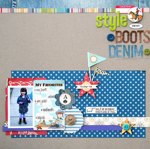
Knowing that I would be working with Sasparilla from October Afternoon, I caught these photos of my daughter this weekend.  I went with blues and denim, boots and some outdoor fun!  I didn't realize that she had on the strong purple...a color not in the collection.  What to do?  Bring some in...

I went with lots of blue accents on this page.  I wanted that color to be prominent.  I also wanted to pop the red in the right places, near the photo and toward the title.  But what to do about the purple?  How about a strip along the bottom...it connects her photo to the layout.


Since this layout is about her style, including her jean jacket...I had to use the denim paper along the top.  I love how these alphabet letters from OA look almost stamped on....I used the Feb. kit from My Scrapbook Nook to create this layout.


To add more details, I layered up the star here.  Aren't the flag super cute!


I love how the journaling card and button all go with the theme...

and how they go with the purple.  Original color scheme or not.


LinkWithin

Related Posts Plugin for WordPress, Blogger...