Showing posts with label Tips. Show all posts

Wednesday, January 22, 2014

Tuesday's Tip: Go Back

I remember when I started designing for Webster's Pages, well before Clean and Simple was a part of their approach.  I used the products differently than most classic WP designers.  Honestly, I love all the fussy layering and artsy stuff.  I just can't make it work.

But my style back then was a little more feminine,  I used more fussy cutting just in a cleaner way.  There were more patterns on a page and more bling.  My style may have changed a bit, but I know my roots.

It was fun to go back to a more classic Webster's approach when I was making some pages for the trade show.  I used one of Brandin's new collections, Party Time.  This page has a familiar feel to me and I like it.

 
I still have lots of straight lines, but I added lots of pattern, color, shapes and size.  I hand cut the garland from a sheet of the paper and layered it along the bottom of the top portion of the page.  I added in this cool sun, using straws to add dimension.
 
 
I also fussy cut that cluster of presents and the stars at the top.  I love Webster's because of this very reason.  You can cut, arrange and use each element in a unique way.  Every page is different.
 
It was fun going back. 
 

Tuesday, December 17, 2013

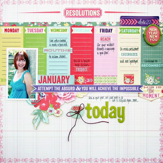
Tuesday Tip: Match it Up!

For my most recent Webster's Pages layout, I decided to do some fun journaling.  I used color as my muse.

The New Year, New You line from Adrienne Looman is fantastic.  It is full of beautiful colors and ledger paper.  I love the idea of this collection....you are meant to journal with it.

 
I used the days of the week paper across my page and grounded all my elements on it.  I decided to use the columns as my place to journal.  I took it a step further by matching the color of each resolution tag with the color of the column. 


Routine, respect, reach, exercises, and reconnect...key words that sum up where I want to go in 2014.  I put each key word down and journaled around it.
 
I added other touches like the flowers and pretty bow.


This page came together very quickly.  I just followed my gut and worked with the day paper, matching all the colors along the way!


Tuesday, October 15, 2013

Have A Lot To Say: Layer It!

I love how paper collections come with so many journaling cards, stickers and die-cuts with words.  Those elements typically get the creative thoughts moving, and inspire me to go in a specific direction with a page. 
 
Take this page!  I wanted the neutral base to pop off the woodgrain paper.  But then I needed other color.  I was drawn to so many of the typography elements so I decided to just use them all!


I layered the majority of my stickers and die-cuts from the Family Traditions collection by Adrienne Looman and Webster's Pages at the top of my page.  It balances out the woodgrain and compliments the white space on the bottom.
 
Not sure how to edit down?  Just use it all in smaller pieces, layered!  It will give you a good result!


Tuesday, August 27, 2013

Tuesday Tip: Keep it Simple

I think life should be more simple.  Less stress, more relaxation.  Less drama, more girl time.  Less yelling, more hugs.

Simple works.  It has worked for Steve for a long time as he strives to keep life simple and calm.  I am trying to move there.  It is not in my personality.

It is in my scrappy style, though.  For a recent layout, I kept the design and embellishments simple and focused.  I worked with several common and repetitive elements that had some boldness.

Not to mention, I had the amazing Allison Kreft Recorded collection to work with.  Love this girl's designs...

Here is my page!


I love this picture of Ella and me.  We are pure joy for each other here.  And that is not always the case.  This photo was a selfie and was totally spontaneous.  I wanted it to shine.  I decided to use the overlays to create a bit of a grid.  There is a whole sheet of these babies...awesome!

I put patterned paper underneath and added some simple embellishments to the overlays.


Love the sticker sheet that comes with this collection!  Gray letters in a great font!


I added some simple touches like the cassette charm and the hemp twine.   

Sometimes life calls for simple!


Thursday, April 25, 2013

Thursday Tip: Make it Girly

Creating a layout about a girl?  Make it girly.  Trying to convey sweetness?  Make it girly.

I decided to go pretty and oft and blingy on my most recent layout.  It is about my daughter who is all diva, all girl.


I used the new Summer Stories collection by Teresa Collins to make this page!  It is a mid season release and it is so pretty!  

To add girly touches, I started with the graph paper with the gold scroll along the side.  I placed the floral along the top and proceeded to add feminine details.  The banner, buttons, and borders are all meant to enhance the page.


I love this photo of Ella.  It captures her...silly, dramatic, adorable!    I framed the photo with the journaling cards along the top and the brad along the bottom.

If you are going girly, go all the way.

I think you will end up with pretty!


Tuesday, March 5, 2013

Tuesday Tip: Use a Part of It

Worried about the length of a ribbon or piece of fabric?  How about the size of a doilie or chipboard piece?
Too big...no such thing!

If there is an element you love, but the size doesn't quite fit the space...you use a piece of it.

Take the Story Marker from Webster's Pages on this page...  I love the Story Markers, but I only needed a touch...just a little bit.


I decided to cut a bunch of the Story Marker off...I plan to use the extra...it is soft and pretty fabric so why not?  I tucked the Story Marker under the Perfect Accent...a great combination. I used the Park Drive from Webster's Pages to create this layout.


To make my title stand out, I underlined it with bling.  Again, this bling came from a long piece of jewels.  Now, it is customized.

Find an element you love, use it...no excuses!


Saturday, March 2, 2013

Friday Tip: Underline that Title

I am really into grounded elements on a layout.  I think it is why I am so rigid with floating elements and freedom...although I realize I need that in order for work to be non-static.

So, how can I ground and yet have moment.  One tip involves underlining my title.  I often like to use mixed fonts, which works great with underlining.  It keeps a straight line versus the random sizing of the letters.

Underlining can be done with a pen or even with paper.
Little strips.

Here is a recent layout using the New Beginnings collection from Webster's Pages.  If you are looking for a sweet spring collection and one that works great for Easter...check this one out.


I love the pinks and greens in this collection.  I decided to add some curves using the oval Perfect Accent, the doilie and the hand cut Easter eggs.  I feel like my title would have been floating around so I put the yellow paper under it.  Gives it a bit of pop!

I used the blue and pink alphabet in different sizes and prints.  The Celebrate banner was cut from a sheet of paper.


Interest, and movement...yet grounded.

If only I spelled ninja right on the layout...ugh

happy day all!


Tuesday, February 12, 2013

Tuesday's Tip: Finish it Off

I wonder how you create a page.  Do you get the main elements and focal points down and worry about the embellishments after?  Or do you sketch out and plan every detail before you glue?

I often get a page down and am only somewhat happy with the result.  I try to have faith that the last minute touches can really push it to a different place.

When the mainstays are down and the page is almost there, I try to think about what would bring it up a bit.  Kinda like fashion.  What chunky necklace or scarf finishes off an outfit?

For the page below, the twine and title tag were last minute touches.  Those, "hmm, how can I make this page a bit more special."  Sometimes those ideas make me nervous, but often times they work out okay.


I love this photo because it shows Nathan in action!  He loves maps and history and all things nonfiction.  He was our tour guide in DC this summer.  The Far and Away collection by Teresa Collins is the perfect way to record vacation moments.  The maps make me so happy!


I wanted the page to have something unexpected so I added the twine lines from the compass to the globe.  I finished the strings off with enamel dots.  It gives the page texture and movement.

How do you go about finishing off your pages?  I would love to know...


Tuesday, October 9, 2012

Tuesday Tip: Use that Xyron

Especially when it comes in pink houndstooth!  I love the Xyron sticker maker that Teresa has designed.  I used it for my most recent layout.


I knew I wanted multiple frames in random places. These are different mirrors and they fit the theme of my page perfectly.  I knew I wanted the picture on the bottom. What I didn't think of was the placement of my journaling. After surveying my options, I decided to add a strip along the top so it complimented my design, yet didn't distract from it.
I was able to run the thin strip through my Xyron sticker maker and have it lay very flat on my page. Since an 8.5 X 11 piece of paper fits in the printer, your journaling strip can be the same width as your page.


I also ran the small mirrors and die-cut ticket through...the Xyron is super useful and cute!

How perfect!

Wednesday, August 22, 2012

Tuesday's Tip: Layer it Up

Today...I celebrate the summer.  The family vacations, the pool, the backyard parties, the afternoon naps, the sleeping in late, the time with friends...it has been a good one.

Bittersweet now that it is coming to a close.  But I think it is time.  The kids are bickering and we need a routine.  I am hoping for a less stressful fall...my goal is to make that happen.

But, today...I share a summer page.

 
I love these shots...Instagram rocks!  This is our pool and our happy kids jumping into said pool.  That is pure joy!  I swear they jump off the side about 45-50 times each day.  Jump in, swim to ladder, climb out, jump in again.  Over and over...
 
 
I used a lot of layering on this layout.  Easy to do with Bella products.  There are so many stickers and chipboard pieces.  If you look at the top of the layout, I actually used the chipboard yellow border to trace the same scallop on the yellow paper underneath.  It adds that texture I love.  You can see above that I used a black and white frame and then put another chipboard word on top. 
 
I layered to create my title too.  The Happiness tag was cut from a sheet of paper.  I then put the Joy chipboard at the top and added the sticker &.  To give it even more layering and draw the eye, I put the flag in.  It is so fun to create titles using different stickers, chipboard or other materials, all mixed up for interest.


In some ways, as summer ends...layering it up will take on new meaning.  Leggings, sweaters and boots.  Warm blankets, the fireplace and a good book. There is much to look forward to...

Thursday, August 2, 2012

Thursday Tip: Ground that Title

I love titlework...the right fonts, mixed sizes, the correct placement...titles can make or break a page.

I usually know where my title is going as I am designing.  Those days when I am not sure, I struggle about where to put it at the end.

One of my favorite techniques is to place the title on the opposite corner of the page, away from the photo.  The only issue is that is can sometimes appear to be floating.  So, I ground it.

There are many ways to ground a title.  On this layout, I used paper strips above and below the words.  It's a great way to add pattern to a page too!  I also used different buttons all around to draw attention to the words.


This layout uses a mix of Bella Blvd.  I love how their colors all go together...it really stretches the stash!  I am also a sucker for their alpha stickers!


Along with a title, I also like to include other, related words on every page.  To achieve  that, I created this cluster.

I am loving just playing and having fun with paper right now.  A loosening of the rules, yet remembering that grounding helps a page feel cohesive!

Sunday, July 29, 2012

Sunday Surprise: Halloween?

I realize it is August, but fall will be here before we know it.  I love fall...pumpkins, decorating the house and Halloween.  I love Halloween for the kid's sake!

and for Webster's Pages new line, Once Upon a Halloween...it is fun and whimsical, elegant and pretty!  I love it!  I was able to create some layouts for the booth and had fun hand cutting some paper as well as the new transparent overlays.


I cut this hexagon paper around the edges and then placed ones with darker print in the middles of a few.  To use the overlay, I cut the top row of dots out and left the spiders.  It was easy to do with an Exacto knife.  I cut a third to place on the bottom of the layout, creating that visual triangle.


I knew I wanted to use the large Perfect Accent, but the trim was an afterthought.  It started out as a banner, but totally reminded me of spider webs.  So I went with it.  Funny how afterthoughts sometimes are exactly what is needed!

Even though I can't wait for Halloween, I am gladly going to enjoy the rest of the summer!

Friday, July 27, 2012

Tag: You're It!

Happy Friday!  We have a fun weekend ahead and I am looking forward to it!  I am getting ready to paint our bedroom, finally.  The last room to be done before the big bathroom renovation.  I am going a warm gray...I love warm colors.  The colors of fall.

So, using the new Autumn Spice collection from Lily Bee was a joy!  There is a hexagon paper in that line that makes me swoon...I used it for a layout I will share this weekend!

Tags:


See that spicy orange and the blue...love!  I did lots of layering with these tags.


To create this one, I used a circle stamp to create the background.  Then I layered some paper and topped it with the "So Blessed" sticker.  I stamped the word Family and hung it from under the button.


I created a pocket using the blue paper here and placed the sentiment inside the pocket.  I stamped the Here and Now.  The "Thanks" sentiment is a sticker from the Autumn Spice collection. 

I had fun making these tags.  I see more tags and cards in my life!


Tuesday, June 12, 2012

Tuesday Tip: Make it Shine

So I will admit that I hadn't played with designer tape until I recently opened my package from Bella Blvd.  They have cool patterns on their tapes...chevrons, stripes, plaid.  I was intrigued.

I built the layout below using the It's a Girl collection.  It was cute....but something was missing.  Until I decided to add the sun rays.  Typically, it would be laborious to cut rays, but the designer tape made it super easy.

I went with the yellow chevron and just cut along the diagonals to create each ray.  Seriously, the whole sun took 4 minutes to construct.  My kind of scrapbooking...easy, effective, adorable!

Here is the layout:


I am sooo digging monochromatic color tones right now... something about hue upon hue just creates a great base!  I added the circles as my repeating element around the page.  Then the sun...


I am glad I went the next step and created the sun.
It highlights these pictures....a few of my favorite pictures of Ella...the joy....it just radiates!

Tuesday, May 15, 2012

Tuesday Tips: Do what you Love

Even if you have done it before.  Even if the color has been repeated.  Don't overthink.

I spend far too much creative time overthinking...that is stifling and unnecessary.  So I decided to stop.

I have used the green background paper on three layouts in the recent past...but I love the pop it gives.  So I can use it again and just change up the rest of my design.


To add difference to this layout, I incorporated the varying sized circles.  These were cut from a sheet of patterned paper.  I love that pink one!  The biggest change is that I cut that garland from a sheet of paper.  I was going to run several of them horizontally, but decided to curve it a bit.


I topped everything off with a Sparkler and some hemp twine.  This layout was made using the new Girl Land collection...the colors are so vibrant!  I love them.  It is shipping now!  Head to the Webster's site!

And head to the post below and leave a comment as a part of the Webster's blog hop.  Big prizes are on the line!!

Off to watch Dancing with the Stars...hey, what can I say...I love what I love!!


LinkWithin

Related Posts Plugin for WordPress, Blogger...